Oksana Korol

Case study · WalkWith · Self-initiated · Live

WalkWith — Someone has walked this path before you

WalkWith connects a parent who is struggling with a parent who has already lived through the same thing — a first pregnancy, the newborn blur, an IEP meeting, a school move, deciding whether to have kids at all. First names only, always free. This is a self-initiated project I took the whole way myself — from research to a live product, built entirely in Claude: I mapped two parents' journeys, found where the experience broke down, and turned every gap into a shipped feature in a running app.

Product DesignUX ResearchJourney MappingClaude

Open the live product walkwith.x34.ca — no login needed to look around

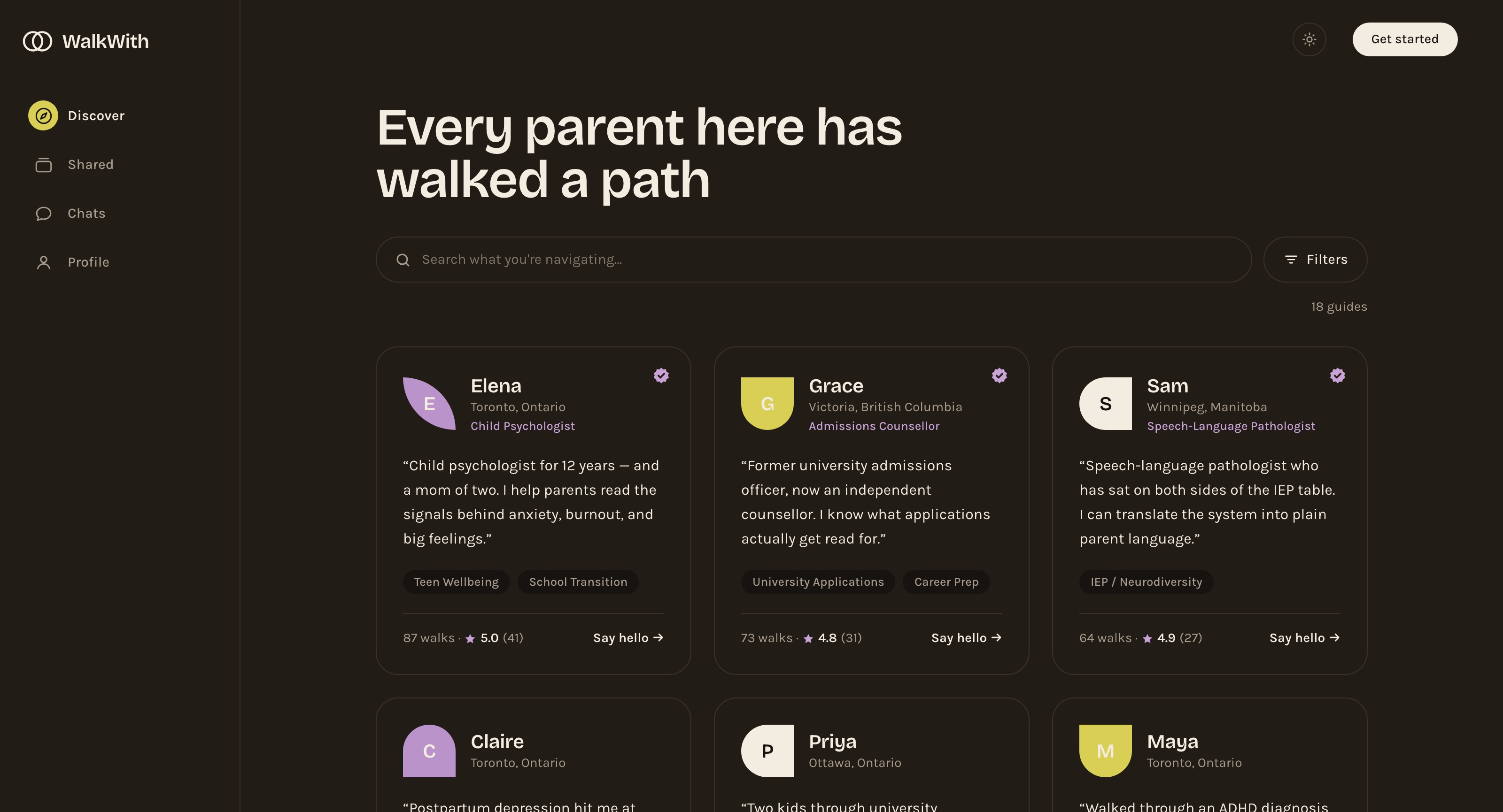
WalkWith Discover in dark mode — the headline “Every parent here has walked a path”, a plain-language search box, and a grid of guide cards each leading with a parent's own words
5
personas across the parenting arc
2
journeys mapped stage by stage
5
gaps turned into shipped features
Live
researched, designed & built in Claude

Overview

Not advice. Someone who gets it.

Parenting is full of moments where the last thing you need is a tip from an app — you need one person who can say “I had exactly this, and you're not broken.” WalkWith is built entirely around that sentence.

A parent describes what they're facing in their own words. They read real stories from parents who lived the same thing, then say hello with a message — no scheduling, no pressure, no account needed to look. Most guides are peers with lived experience; a small verified layer of professionals sits alongside them, clearly labelled. The whole platform is free and first-name only.

I ran this as a self-initiated project and did every part of it myself — from user research and personas through to a live, coded product, all inside Claude. Claude was my design and engineering partner; the product thinking, structure, and decisions are mine.

Challenge

The most vulnerable user is the hardest to hold.

The person WalkWith exists for is often reaching out at 2am, sleep-deprived, half-convinced they're failing at something everyone else finds easy. One clumsy interaction and they're gone for good. So the design had to lower the cost of the first move to almost nothing — and still stay safe when someone types “I can't do this anymore.”

It also had to hold two truths at once: the same person who gives support on the early years might, a year later, be the one seeking help with a school move. The product needed to serve both roles without treating them as strangers.

My role

Sole researcher, designer & builder — start to finish in Claude.

Everything here is mine end to end — research and personas, journey maps, information architecture, UI, copy, and the working coded build that is now live. I ran the entire process inside Claude, moving from insight to interface to shipped feature without handing off to anyone.

  • Research & personas — built a cast of five parents, from a drowning new mum to a quiet non-parent deciding whether she wants kids, each with a distinct safety need.
  • Journey mapping — mapped two personas across seven stages — doing, thinking, feeling, touchpoints, pain points — to find exactly where today's experience failed them.
  • Interaction model — designed the “ladder” of contact — read a story, say hello, keep talking — and cut the scheduled call that was blocking the first rung.
  • Design & build in Claude — took it from map to a deployed app, using Claude as my design-and-engineering partner and closing each mapped gap with a real, working feature.

Built end to end in Claude

One person, one tool, the full arc: I researched, designed, wrote, and coded WalkWith into a live product entirely in Claude — proof that a product designer can now own the path from a blank page to a running app with real users.

Research · Personas

Two parents, two journeys, one map of the gaps.

Rather than design for a vague “parent,” I anchored the work in two people at opposite ends of the same platform. Mapping their journeys stage by stage is what turned a warm idea into a concrete list of things to build.

Emily

New mum · first baby, 3 months · async only

I don't need advice. I need someone to say: I had exactly this, and you're not broken.

Sleep-deprived, possibly living with postpartum depression, and convinced she's failing at something everyone else finds natural. 2am is her prime time. The most vulnerable user on the platform — one clumsy interaction and she's gone for good.

Age 31Possible PPD2am, alone

Pain points

  • Everything online is medical, judgy, or terrifying — nobody says “me too”
  • Forced to book a video call before she can even send a message
  • When she types “I can't do this anymore,” nothing catches it

Needs

  • A low-stakes first move — a message, not a call
  • Real recovery stories she can read at 2am
  • To feel held, not exposed or judged
  • Postpartum-specific guides, not school-age ones
Rachel

Giver & seeker · kids 7 & 4 · relocating

I help other moms all week. Now I'm the one who needs someone — just tell me about the schools.

She gives support on the early years, PPD, and surviving year one — then her family relocates to Calgary and she becomes the seeker, needing schools and a new network. The living proof of the hybrid model: giver and seeker in one person.

Age 38Giver + seekerRelocating

Pain points

  • To the system, Rachel-the-guide and Rachel-the-seeker are strangers
  • Her guide profile stays frozen while her real life turns upside down
  • “Calgary parents” is a question the platform can't actually answer

Needs

  • One identity for both roles, with reputation that travels
  • A living profile: “right now I'm looking for…”
  • Privacy-coarse local matching at city level
  • A real pause control that protects against burnout

Three supporting personas kept the edges honest: Sarah (expecting, wants honest stories not horror stories), Jess (quietly deciding about kids, needs anonymity and to never be told she isn't “a real parent”), and Ryan (the invisible struggling dad — and the platform's hardest trust problem). All three have a place to stand in the live product: Sarah and Ryan have posts in the Shared feed, and “Deciding About Kids” is a first-class topic.

Customer journey map · Emily

From 2am drowning to full circle.

I mapped Emily's journey stage by stage — what she's doing, how she feels, and where it broke down — then turned every low point into something I built. The dip at “Reaching out” is the moment the old design almost lost her.

01

The dark weeks

🌊 Drowning

3am feeds, googling “is this normal,” telling everyone she's “fine.”

Everything online is medical, judgy, or terrifying — nobody says “me too.”

Long-form recovery stories in the parent's own voice, free to read at 2am.

02

First glance

🕯️ Wary flicker

Lands on Discover, types “baby won't stop crying and I'm falling apart.”

Search returned school-age guides — the taxonomy shut the door on night one.

Eleven life-stage topics and a separate life-stage filter, Expecting to Adult.

03

Lurking

🌱 Hope

Reads guide stories with no account, three nights in a row.

One-sentence blurbs were too thin to trust, and a signup wall came too early.

Full stories readable signed-out; the login sheet offers “just looking around for now.”

04

Reaching out

😰 Exposed

Drafts a message, deletes it, rewrites it — finally sends at 2:40am.

The only action was “book a video call” — the rung she's least able to reach.

“Say hello” opens a message box. When typing is too much, a voice note instead.

05

The thread

🫂 Held

Checks for replies during feeds; writes what she can't say out loud.

“I can't do this anymore” had nowhere to go.

Distress-aware crisis resources, plus report & block in every thread.

06

Deepening

☀️ Ready

Two weeks in, the thread has become the thing she looks forward to.

Nothing carried the relationship past the first reply.

Chats: “conversations keep going here — text or voice, at your pace.”

07

Coming through

🔆 Full circle

Months later, adds “I can talk about PPD” to her own profile.

Her giving and seeking selves never connected into one identity.

One profile, two roles — and “🌱 New this week” instead of a row of zeros.

Scroll sideways for the full journey →

From map to build

Five gaps the map exposed — each shipped as a feature.

Reading the two journeys side by side, five things were clearly broken. I designed and built a fix for each one, then re-walked the maps to confirm the pain points had actually closed.

1 · The missing middle rung

The only action on a profile used to be “book a video call” — the rung Emily was least able to reach. I didn't demote the call, I removed it. Every card now ends in “Say hello”, which opens a message box: “No pressure, no schedule — send a message and reply whenever you can. 2am counts.” There is no scheduling anywhere in the product.

2 · When typing is too much

A parent holding a baby one-handed at 3am can't compose a paragraph. Every message box and every post box takes a voice note and writes it down: “Typing feels like a lot? Tap the mic and just talk — we'll write it down.” The lowest rung on the ladder got lower still.

3 · The life-stage blind spot

Search used to return school-age guides to a mum with a newborn. Topics now span the whole arc — eleven of them, from Deciding About Kids and Postpartum through IEP / Neurodiversity and University Applications — filtered on three independent axes: topic, life stage (Expecting → Adult), and city.

4 · A safety layer

“I can't do this anymore” now has somewhere to go: distress-aware crisis resources surfaced gently in the thread, report and block in every conversation, and a standing line under every message box — “a peer with lived experience, not a professional. First names only, always free.”

5 · One person, two roles

A single profile holds “I can talk about…” and “Right now I'm looking for…”, so Rachel-the-guide and Rachel-the-seeker are the same account. Reputation travels when you ask for help, and a pause control protects guides from burnout.

Honestly still open

The peer disclaimer still shows on verified professionals' profiles and needs to become tier-aware. Beyond that: gentle reply notifications, guide burnout check-ins, a shared “what we found” note per walk — and a production distress classifier rather than a heuristic.

The product · Discover

Every parent here has walked a path.

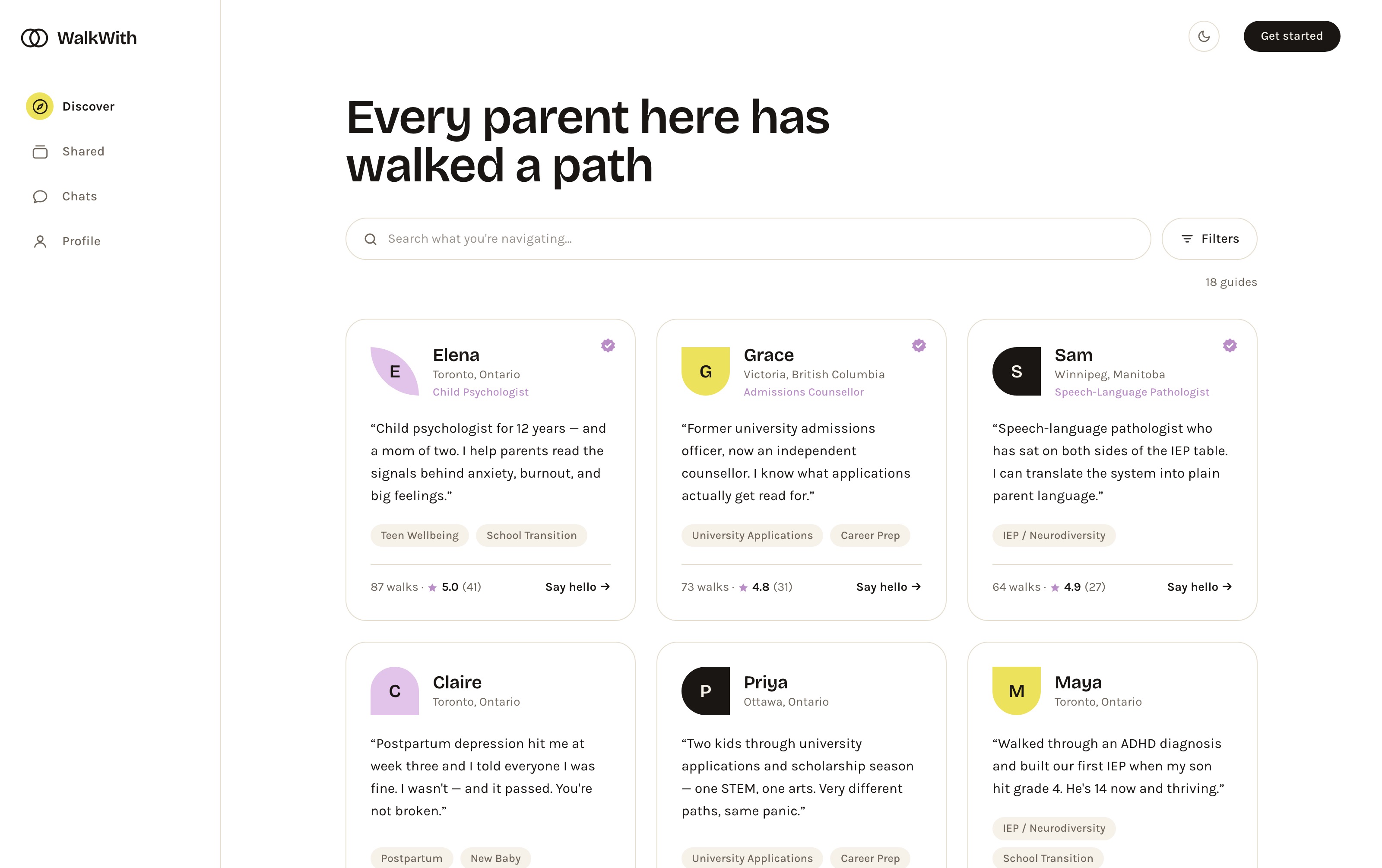
Discover is the front door — no marketing page in front of it, because the guides are the pitch. You describe what you're navigating in plain language, and every card leads with a real story in the parent's own voice, not a bio. Under it: the topics they can talk about, how many walks they've shared, and a single action — Say hello.

Two trust decisions live on this screen. Most guides are peers, and their credential is the story itself. A small verified layer — a child psychologist, an admissions counsellor, a speech-language pathologist — carries a badge and a role label, so professional help is findable without the platform pretending everyone is qualified. And a brand-new guide shows “🌱 New this week” rather than a row of zeros, so a cold start doesn't read as a bad rating.

WalkWith Discover — a grid of guide cards, each with a first name, city, a personal quote, topic tags and a walks-and-rating count; the first three carry a verified badge and a professional role label
Discover — story-first cards, one action per card, and a verified layer that sits beside the peers rather than above them.

The product · Finding the right person

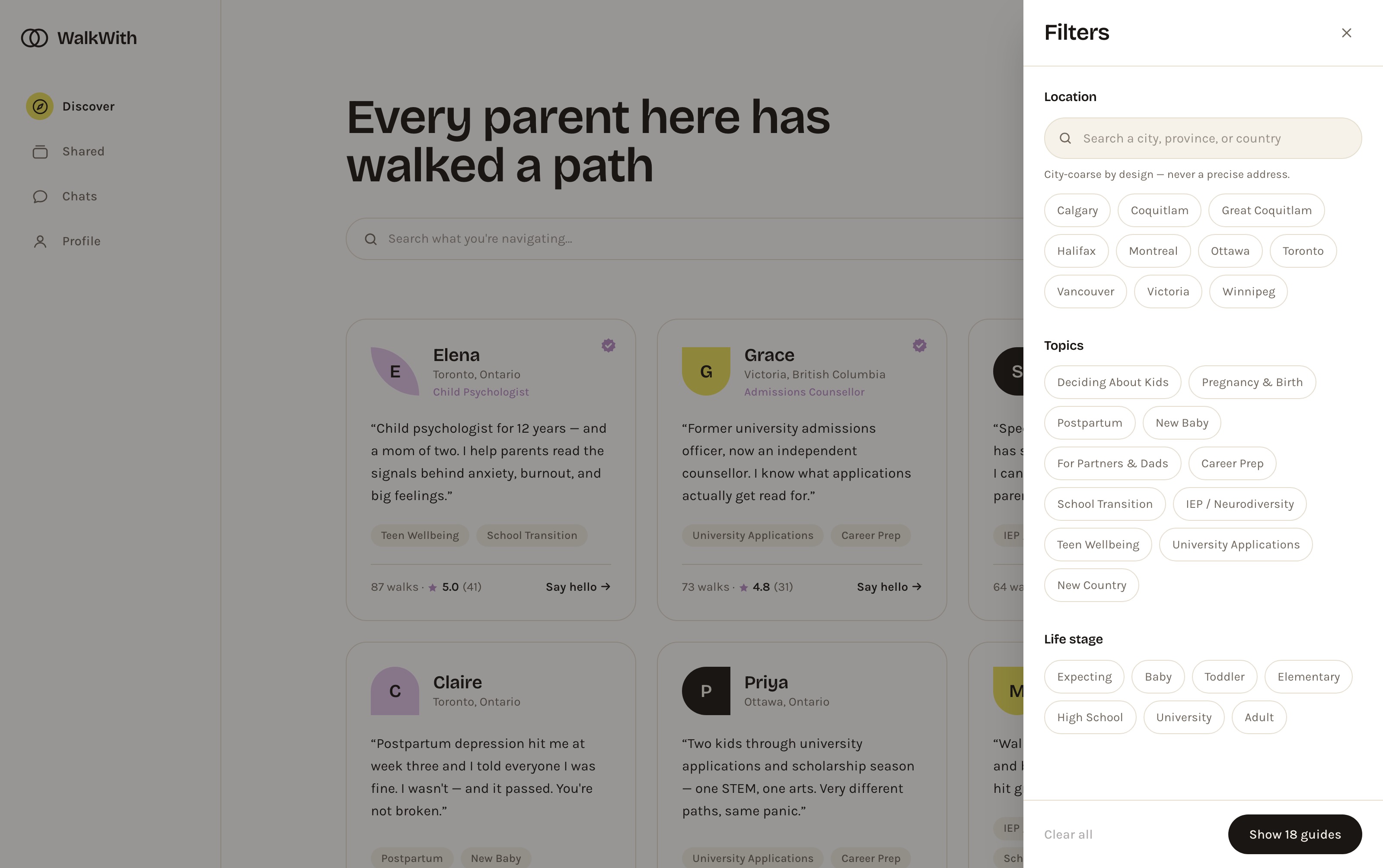
Three axes, and a privacy promise written into the filter.

The original taxonomy had one axis and it failed Emily on night one. Filtering is now three independent axes — location, topic, and life stage — because “postpartum” and “baby” and “Toronto” are different questions, and a parent usually has an answer to only one of them.

Location is deliberately blunt. The filter offers cities, never neighbourhoods, and says so in the panel itself: “City-coarse by design — never a precise address.” Putting the privacy decision in the UI, in plain words, does more for trust than a policy page nobody opens.

WalkWith filter panel — a location search with city chips and the note “City-coarse by design — never a precise address”, eleven topic chips, and seven life-stage chips from Expecting to Adult
The filter drawer — three axes, city-coarse location, and the privacy rule stated where the choice is actually made.

The product · The guide profile

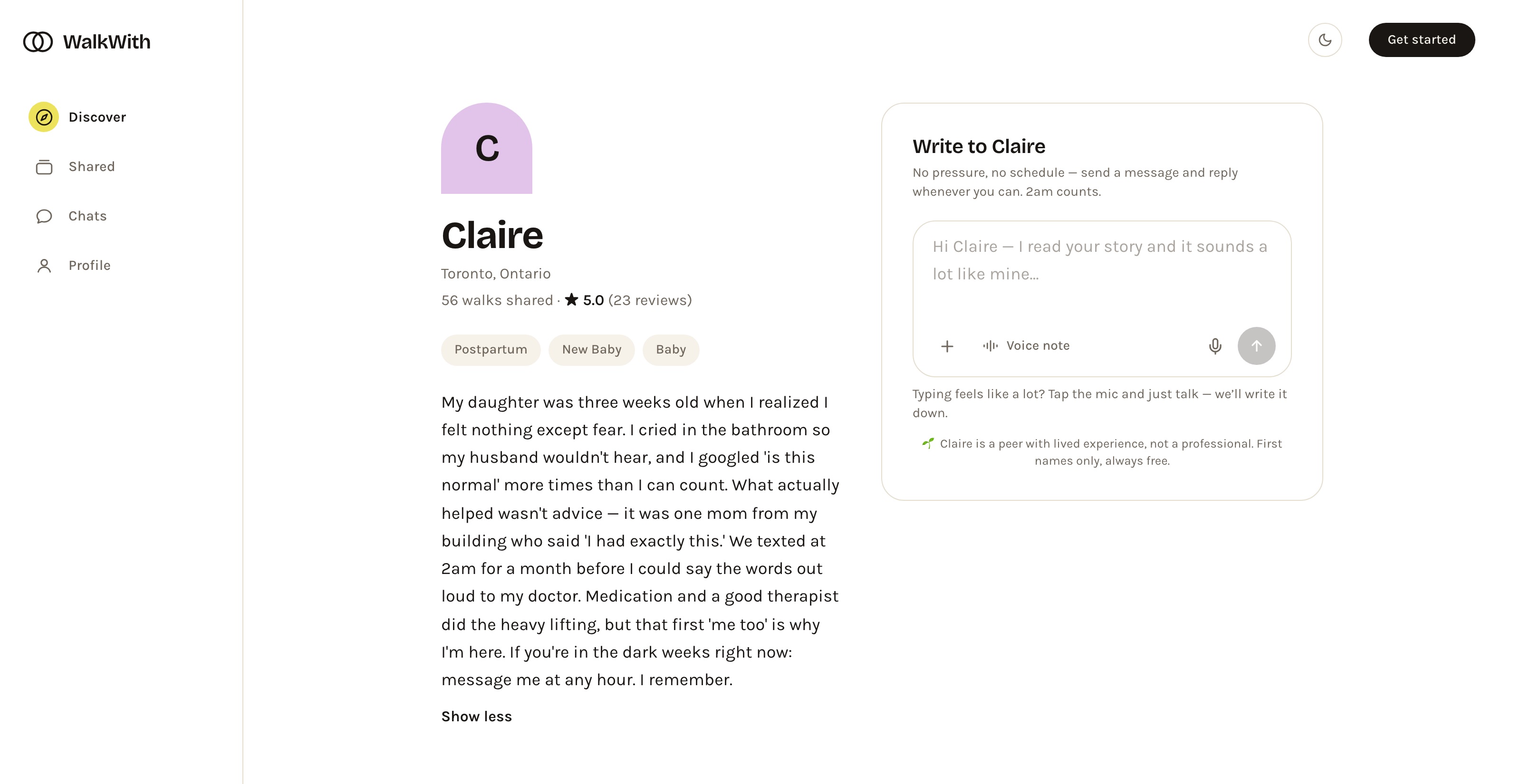
Start with a message. Or just talk.

The profile leads with the longer story — the honest version, the one that names the bathroom crying and the 2am texting — and makes the smallest possible first move the default. There is no calendar, no call to book, no rung above the one Emily can reach: just a message box, pre-seeded with “Hi Claire — I read your story and it sounds a lot like mine…”

Next to it sits the mic. A parent who can't type can tap it and speak, and WalkWith writes it down. Under the box, unmissable and never dismissed, is the boundary that keeps the whole model safe: this is a peer with lived experience, not a professional.

WalkWith guide profile for Claire — her full postpartum-depression story on the left, and a “Write to Claire” message box on the right with a voice-note option, a mic button, and a line noting she is a peer, not a professional
Guide profile — the story carries the trust, the message box is the only action, and a voice note is there for the nights typing is too much.

The product · Shared

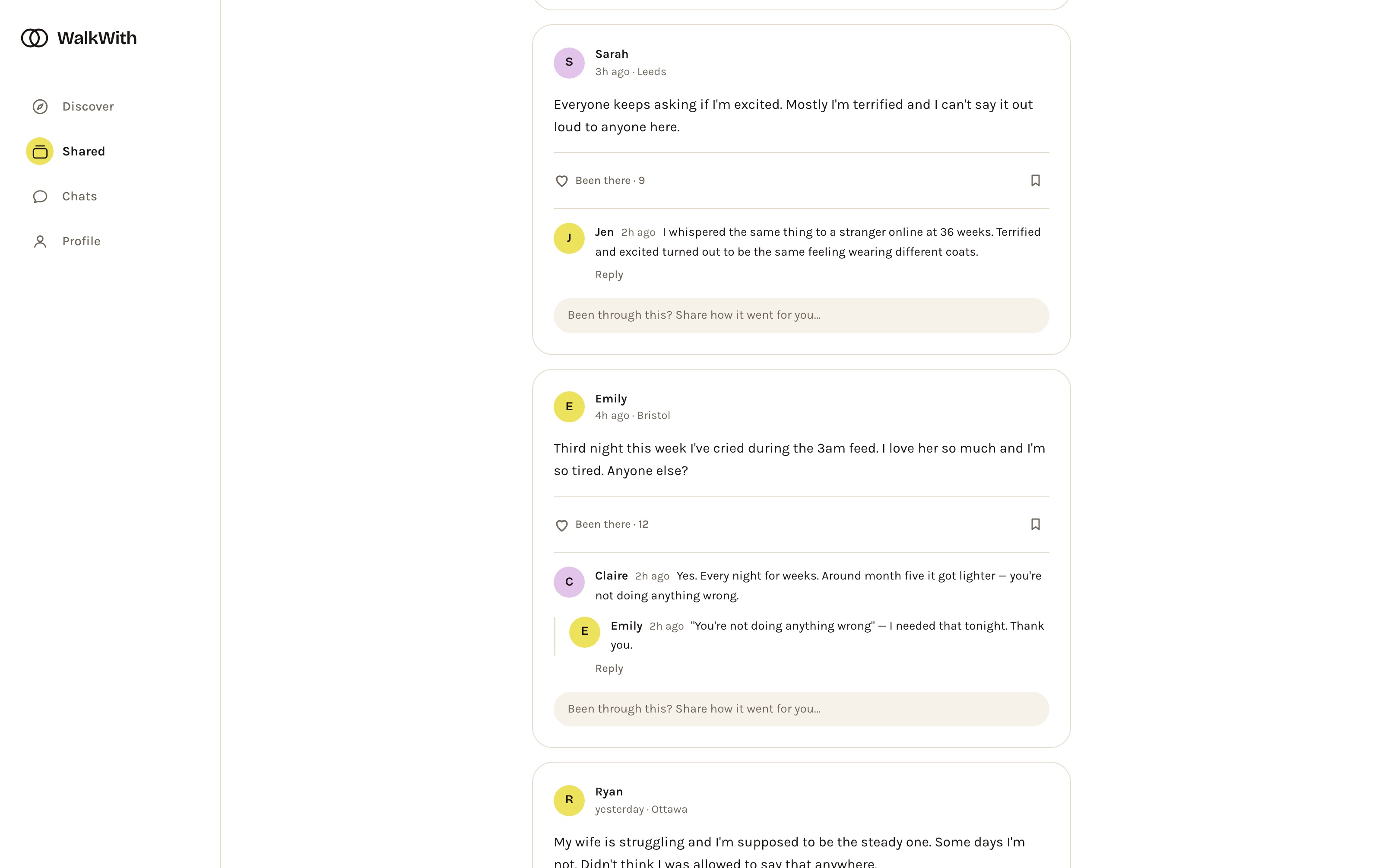
A place to be heard, not fixed.

Not everyone is ready to message a stranger. Shared is a lighter feed where parents post how it actually went — hard nights included — and get “been there” instead of “you should.” The norms open the space and set the tone: speak from experience, advice only when asked, and what's shared here stays here. Even the reply field steers people away from advice: “Been through this? Share how it went for you…”

The reaction is “Been there,” not a like — the one signal this product actually needs. And the same mic from the guide profile is in the compose box, so a post can be spoken too.

WalkWith Shared feed — Sarah's post about being terrified rather than excited, and Emily's post about crying during the 3am feed, each with “Been there” counts and replies that answer with experience rather than advice
Shared — “Been there” instead of a like, replies that answer with experience, and a prompt that asks how it went for you rather than what she should do.

The product · Built for 2am

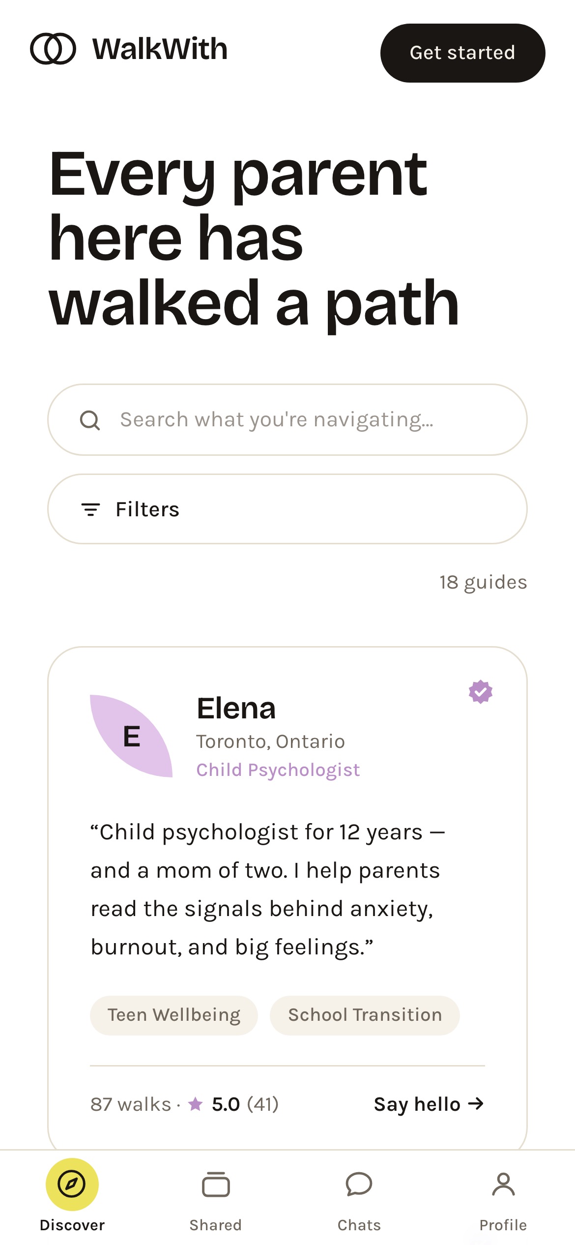
A phone, in the dark, one hand free.

WalkWith on a phone — the Discover headline, search and filter controls, a full-width guide card, and a four-tab bottom bar: Discover, Shared, Chats, Profile

Emily's session happens on a phone, at night, while feeding. So the product is a four-surface app rather than a website: Discover, Shared, Chats, Profile — a sidebar on desktop, a thumb-reachable tab bar on mobile, with each card a single column and every target oversized.

Dark mode isn't a preference toggle here, it's the 2am case: a screen that doesn't wake the baby or blind a parent who has been up since three. The whole palette was built to survive the switch, tint chips and verified badges included.

And nothing asks who you are until it has to. You can read every story, open every profile, and browse the whole feed signed out; the login sheet appears only when you send something, and it still offers the way out — “just looking around for now.”

Outcome

A warm idea, pressure-tested into a live product.

Research drove the build

Two journey maps didn't just illustrate the idea — they generated the backlog. Every feature traces back to a specific pain point on a specific persona's journey.

The hybrid model, proven

Giver and seeker live on one identity, with reputation that travels and a pause that protects wellbeing — the concept's riskiest bet, made concrete.

Safety designed in, not bolted on

Distress-aware resources, reporting, a verified tier for professionals, and the peer-not-therapist boundary in every message box — because the most vulnerable user set the bar.

Shipped, not mocked up

From blank page to a deployed app taking real signups — research, product thinking, UI, copy, and the coded build — all done by one person inside Claude.

See it for yourself No account needed — read any story, then decide.

Next case study

Online-to-Offline Healthcare Platform — five products, one opening day.

Read it

© 2026 Oksana Korol