Oksana Korol

Case study · NexJ Systems

AI Next Best Action for Fintech

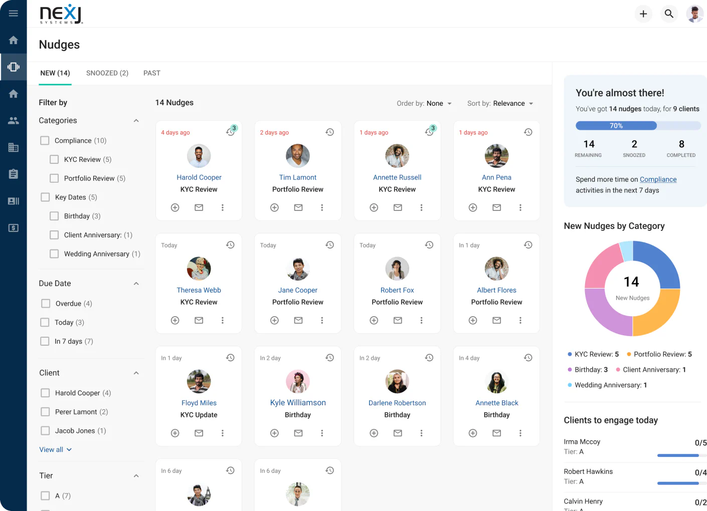
NexJ's CRM gave financial advisors everything — and made nothing easy to find. I designed the AI-driven Nudge Workspace that turned data overload into 3-second decisions.

UX DesignFintechUser ResearchDesign System
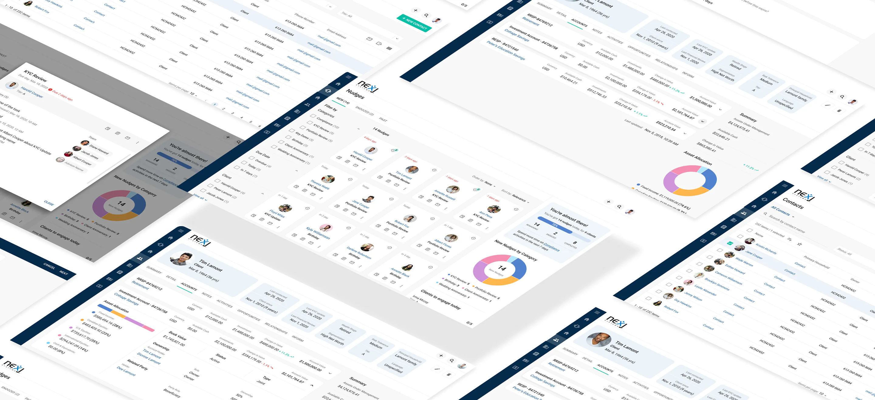
The redesigned NexJ Nudge Workspace: a light CRM dashboard surfacing prioritized next-best-action nudges alongside a clear financial-accounts summary
+40%
faster task completion
95%
advisor preference
+25%
increase in engagement
−20%
time to client data

Overview

An intelligent CRM that wasn't acting intelligent.

NexJ Systems builds an intelligent CRM for financial services — the system of record advisors use to manage client relationships, portfolios, and compliance. Its AI could surface valuable signals about who to call and why, but that intelligence was buried inside dense, static screens.

The goal was a dedicated Nudge Workspace that reframed the product around a single flow: Insight → Action → Result. Instead of asking advisors to hunt through data, the platform would tell them the next best action — and make it a click away.

Problem

Information overload, no focus.

Research with advisors revealed a workflow working against them. The original interface presented everything at once, with no prioritization — so key client events slipped through, and financial data was hard to interpret or act on.

Fragmented workflows meant advisors spent excessive time locating essential metrics. Mixed currencies with no clear totals made a portfolio's real position hard to read at a glance. Engagement stayed low because nothing told advisors what actually mattered right now.

“I have to hunt for AUM and performance every time.”

Financial advisor, discovery research

My role

Senior Product Designer.

I owned the design of the Nudge Workspace end to end as the solo designer, partnering with product, AI, and data science teams inside a 20-person group over five months. Design in Figma, workshops in Miro, shipping to a cloud CRM and React Native.

  • Product vision — facilitated workshops that defined the Nudge Workspace concept.
  • Information architecture — structured financial data into Insight → Action → Result flows.
  • Interaction design — micro-interactions for nudges, updates, and follow-ups.
  • Visual system — extended the design system with data-viz and prioritization components.
  • Prototype & testing — two rounds of remote usability testing, five advisors each.
  • Collaboration — worked with AI & data science to contextualize predictive insights.

Research plan

Grounding AI in advisor reality.

Before a single nudge was designed, we mapped who advisors are and what they actually need — through workshops I facilitated with PMs, the SVP, and the VP of Financial Services Solutions, and remote testing with practicing advisors.

  • 02Discovery workshops — Empathy Map & Value Proposition Canvas
  • 01Customer journey map — behaviour and mindset step by step
  • 10Remote testing sessions — two rounds, five advisors each
  • 40+Nudge screens mapped — every state, filter, and flow connected
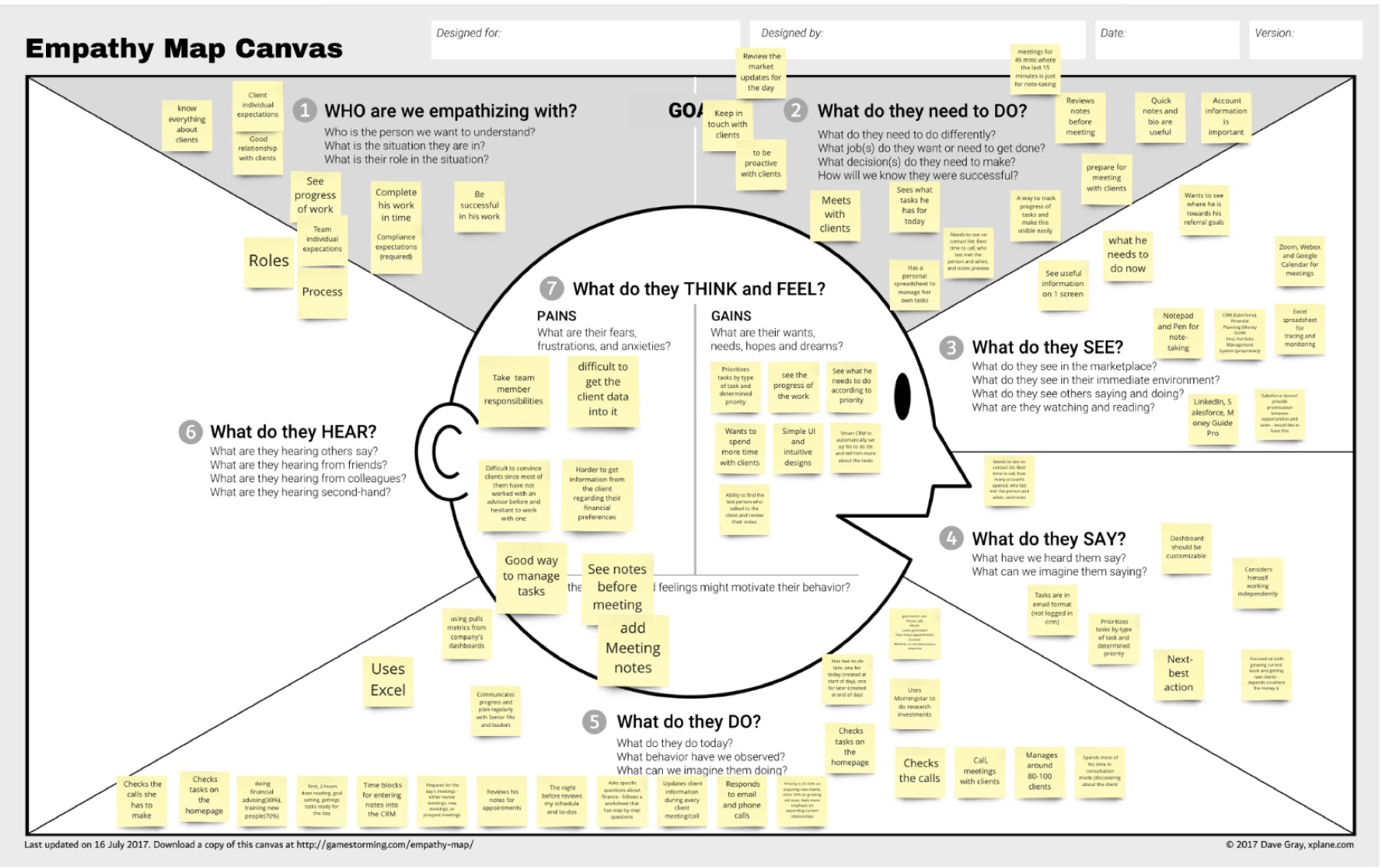
Empathy Map Canvas covered in sticky notes capturing what advisors see, hear, say, do, think, and feel
Empathy Map — what advisors see, hear, say, and do, distilled from interviews and prior research.
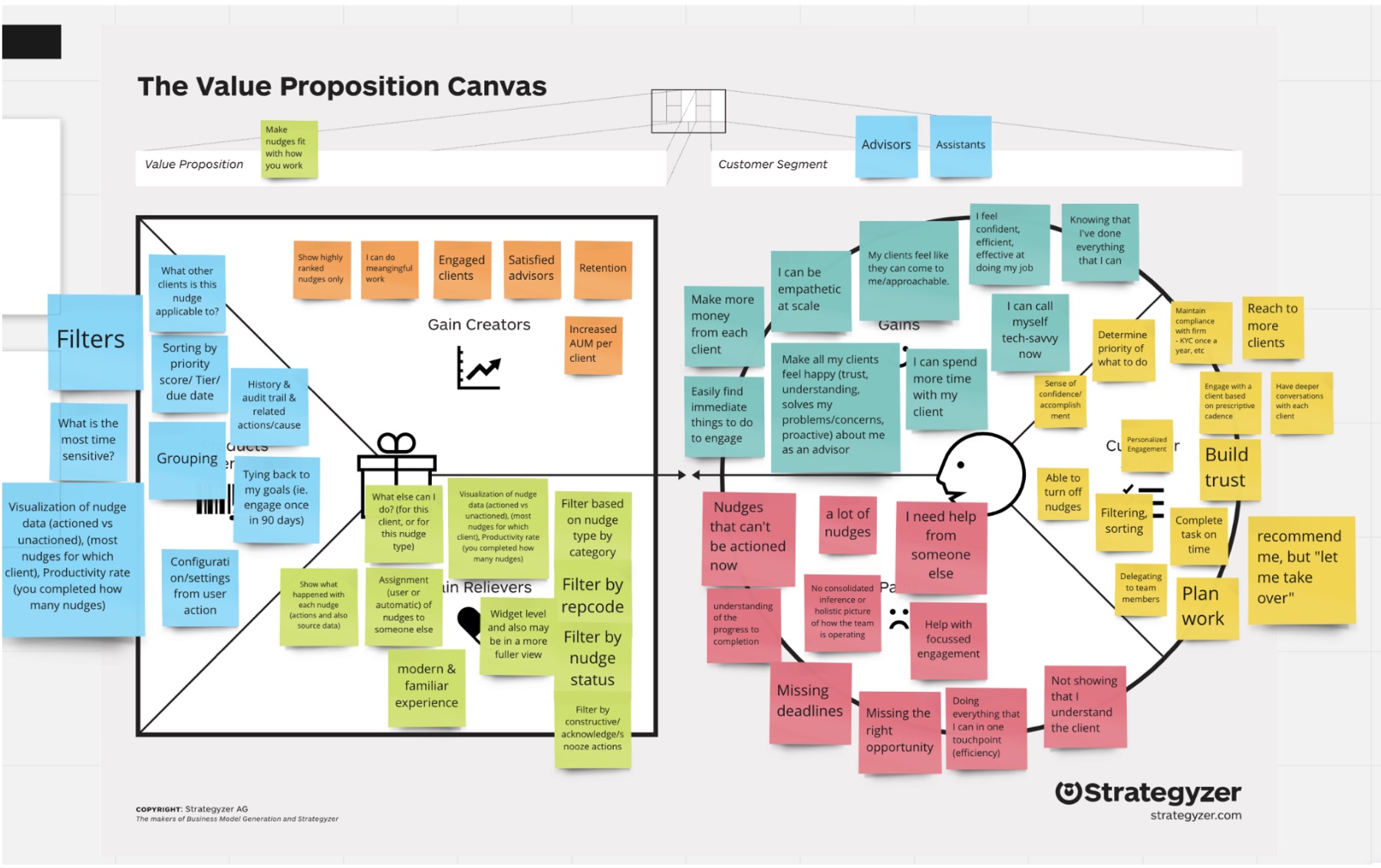
Value Proposition Canvas mapping advisor pains and gains against nudge features like filters, grouping, and progress visualization
Value Proposition Canvas — run with PMs, the SVP, and the VP of Financial Services Solutions to test whether nudges addressed essential advisor pains and gains.

Research · Persona

The advisor we designed for.

Insights from the empathy map and interviews condensed into one profile — an experienced advisor with a large book of business and no patience for hunting through screens.

Henry

Financial Advisor · 18 years of experience

Everything useful on one screen — and don’t make me click twice.

Henry manages a large book of business organized around households. He meets clients at their offices, calls constantly, and updates many records at a time — so slow performance and buried data cost him real money.

Age 40Tech savvyKeeps it simple

Pain points

  • Key info scattered across screens
  • Tracking interactions & in-progress tasks
  • No visual indicators on the dashboard

Needs

  • Minimize clicks — key information on one screen
  • Drill from household level down to members
  • Quick access to interactions, with batch updates
  • Visual representation of data in a modern UI
Approach

One flow: insight, action, result.

Rather than redesign screen by screen, we rebuilt the experience around the decision an advisor is actually trying to make — and validated every step with real advisors.

01 — Insight

Surface what matters

AI-ranked nudges bring the right client event to the top, so advisors see the signal instead of searching for it.

02 — Action

Make it one click

Each nudge carries its next step — call, follow-up, rebalance — with the context needed to act right there.

03 — Result

Close the loop

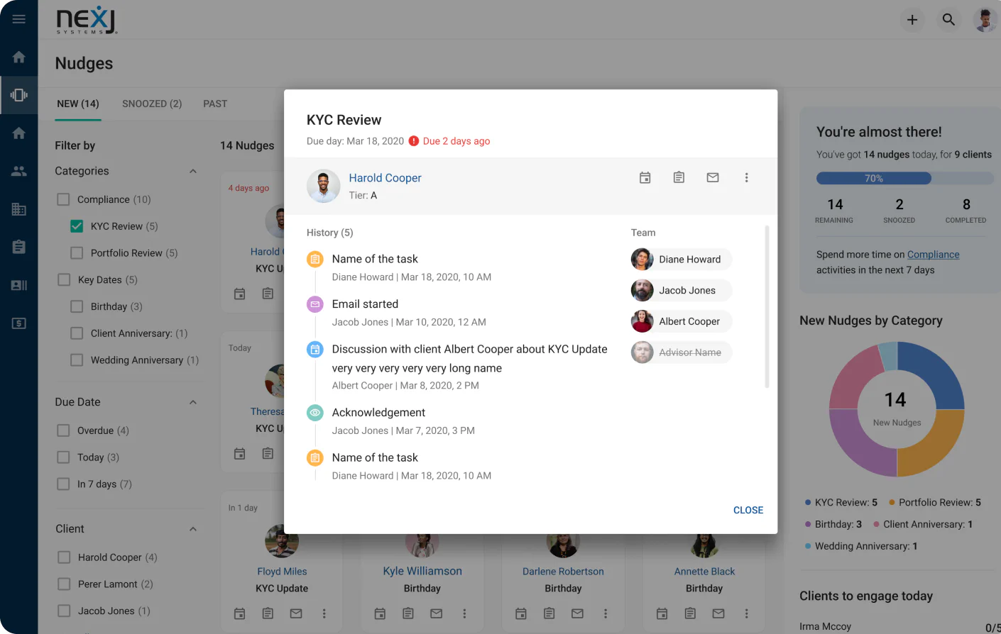
A shared history logs activity and follow-ups, keeping the whole team aligned on what's been done.

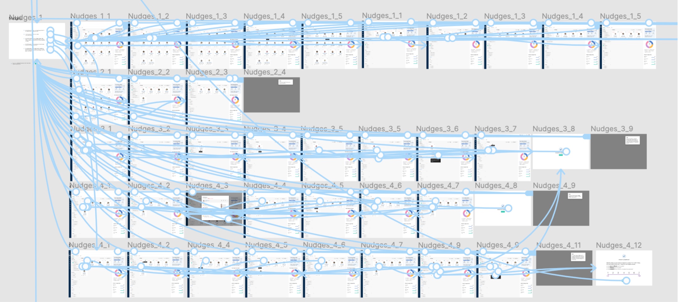
Figma user-flow map connecting more than forty Nudge Workspace screens across four iterations, with every state and transition linked
The full Nudge flow map — 40+ screens across four iterations, every state and transition connected before high-fidelity design.

Design improvements

Financial accounts, before → after. Drag the line.

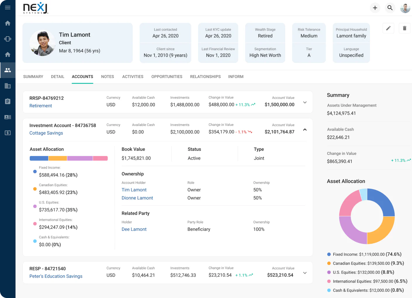
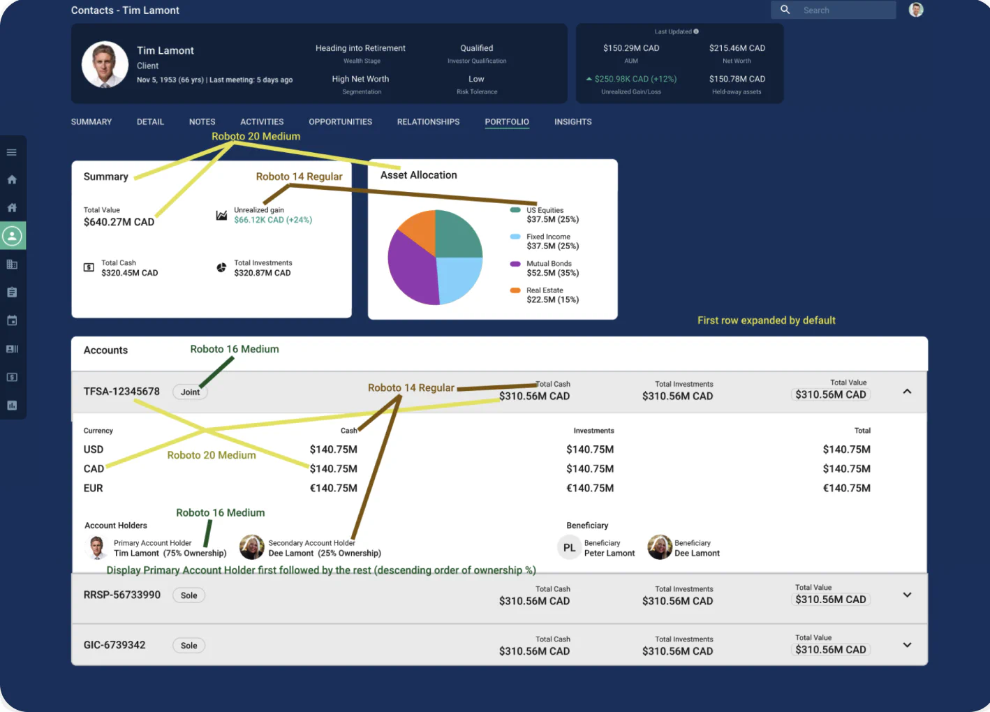
The old accounts view was dark and cluttered, mixing USD, CAD, and EUR with no clear totals — advisors spent 15+ seconds locating AUM and performance. The redesign delivers the same answer in about three seconds: a unified USD summary, a bold $4.12M AUM figure, clear performance indicators, and WCAG AAA contrast.

After: the redesigned light financial-accounts view with a unified $4.12M AUM summary, bold performance indicators, and clean charts
Before: the old dark, cluttered accounts dashboard mixing multiple currencies with no clear totals
Before After

Outcome & impact

From static CRM to proactive intelligence.

Faster decisions

40% faster task completion post-launch, with 20% less time spent locating client data.

Advisors preferred it

95% of advisors chose the new workspace across both rounds of usability testing.

Higher engagement

A 25% lift in engagement as micro-motivational cues pulled advisors into the flow.

Team alignment

Shared history kept teams in sync, turning the CRM into a relationship-intelligence tool.

“I see everything I need in one glance.”

Financial advisor, post-launch

Next case study

WalkWith — someone has walked this path before you.

Read it

© 2026 Oksana Korol