01
Orders, under control
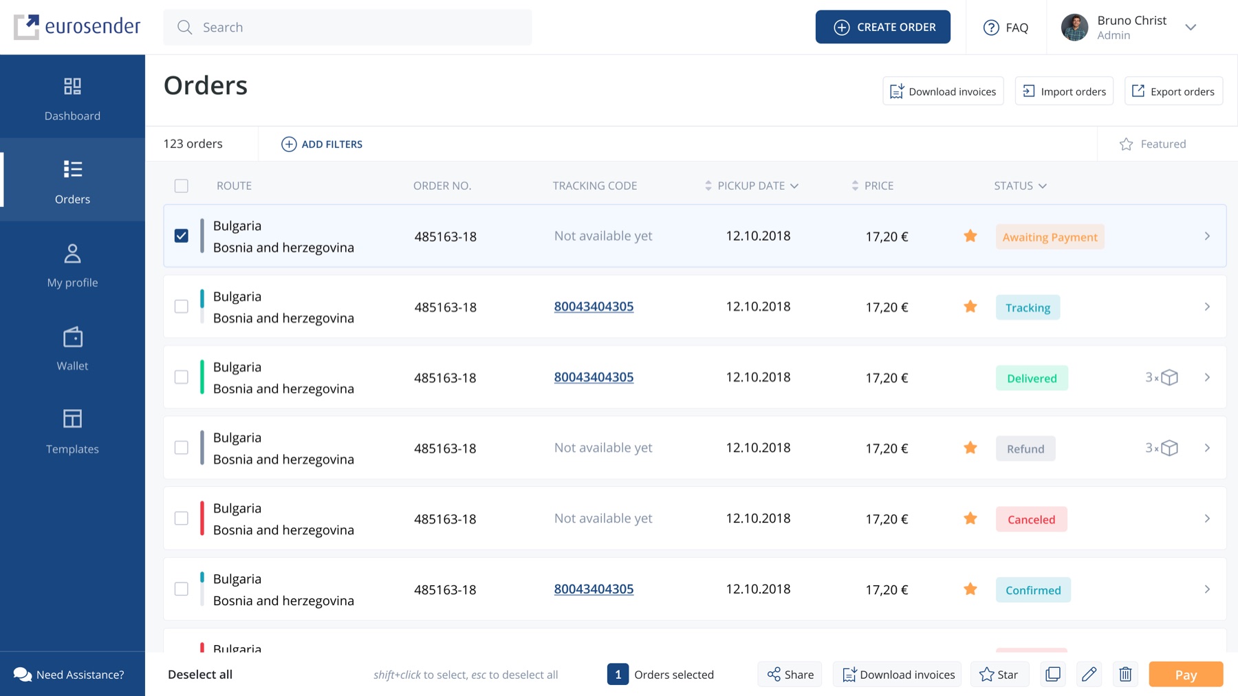
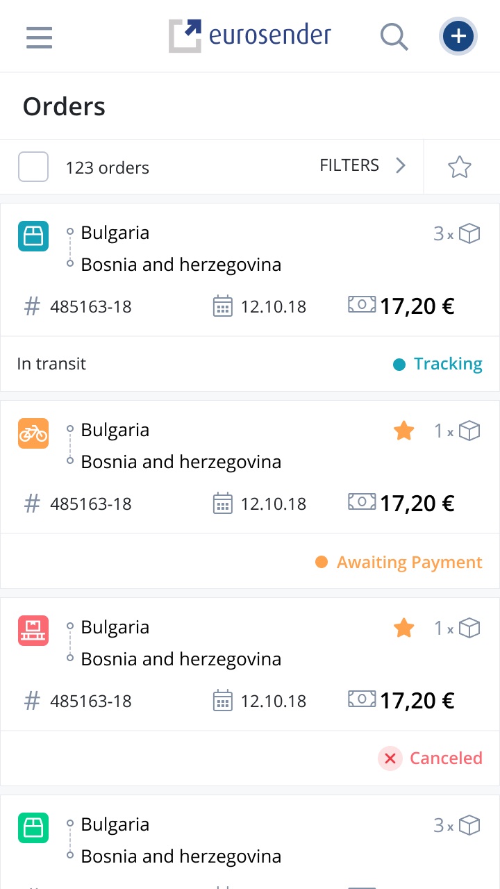
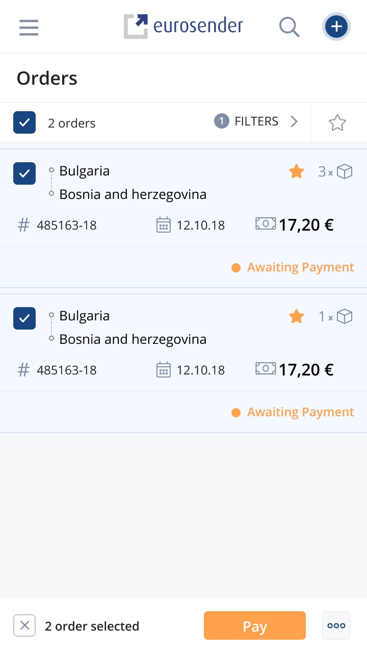
Color-coded statuses, filters, favorites, and batch actions — select several orders and pay, star, or download invoices in one move.
Case study · Eurosender
Eurosender is a leading digital platform for booking logistics services across Europe. I led the end-to-end design that turned a shipment aggregator into a self-service, automation-first platform — in three months.
Overview
Eurosender made booking a courier as easy as booking a flight — but behind the booking, everything else still ran on emails and support tickets. Tracking a shipment, changing an order, downloading an invoice, topping up credit: each meant asking a human for help.
The company set out to evolve from shipment aggregator to self-service logistics platform — scalable, efficient, and automation-first, serving both B2B teams and B2C customers. The deadline was fixed: three months from kickoff to launch.
Problem
Analytics and interviews mapped the friction: users couldn't see where a shipment was, what a past order contained, or how much credit their team had left. B2B delivery managers — creating orders daily — had no way to batch-pay, no templates, and no visibility for the rest of their team.
Every one of those gaps became a call or an email. Support costs grew with every new customer, and frustrated B2B accounts — the highest-value segment — churned to competitors with better tooling.
“I can't find information about my order — so I call. Every time.”
B2B delivery manager, discovery research
My role
I led end-to-end design across web, mobile, and tablet — from research and product architecture through a new design system to usability testing, working alongside product and engineering against a three-month deadline.
Research · Personas
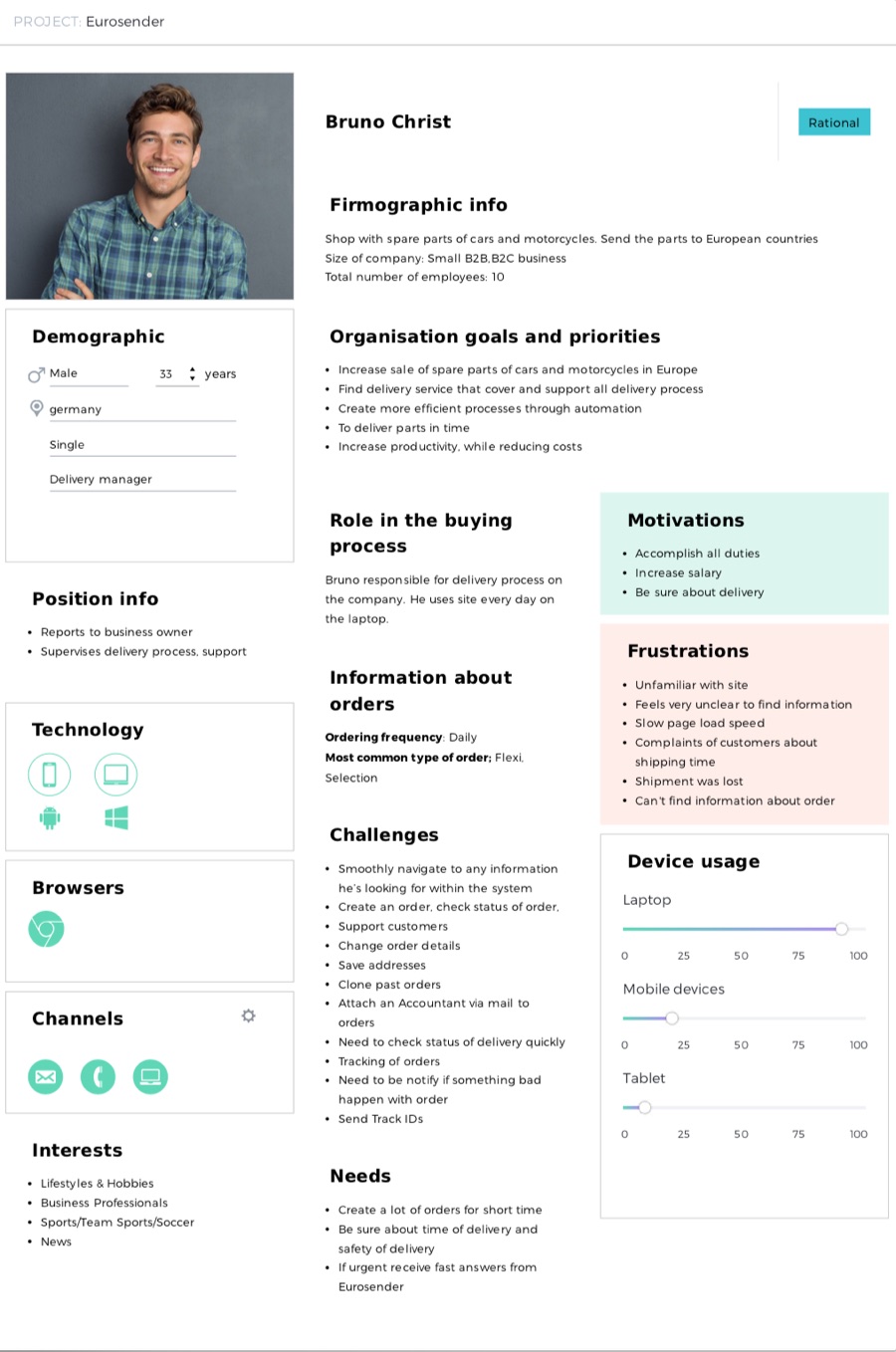
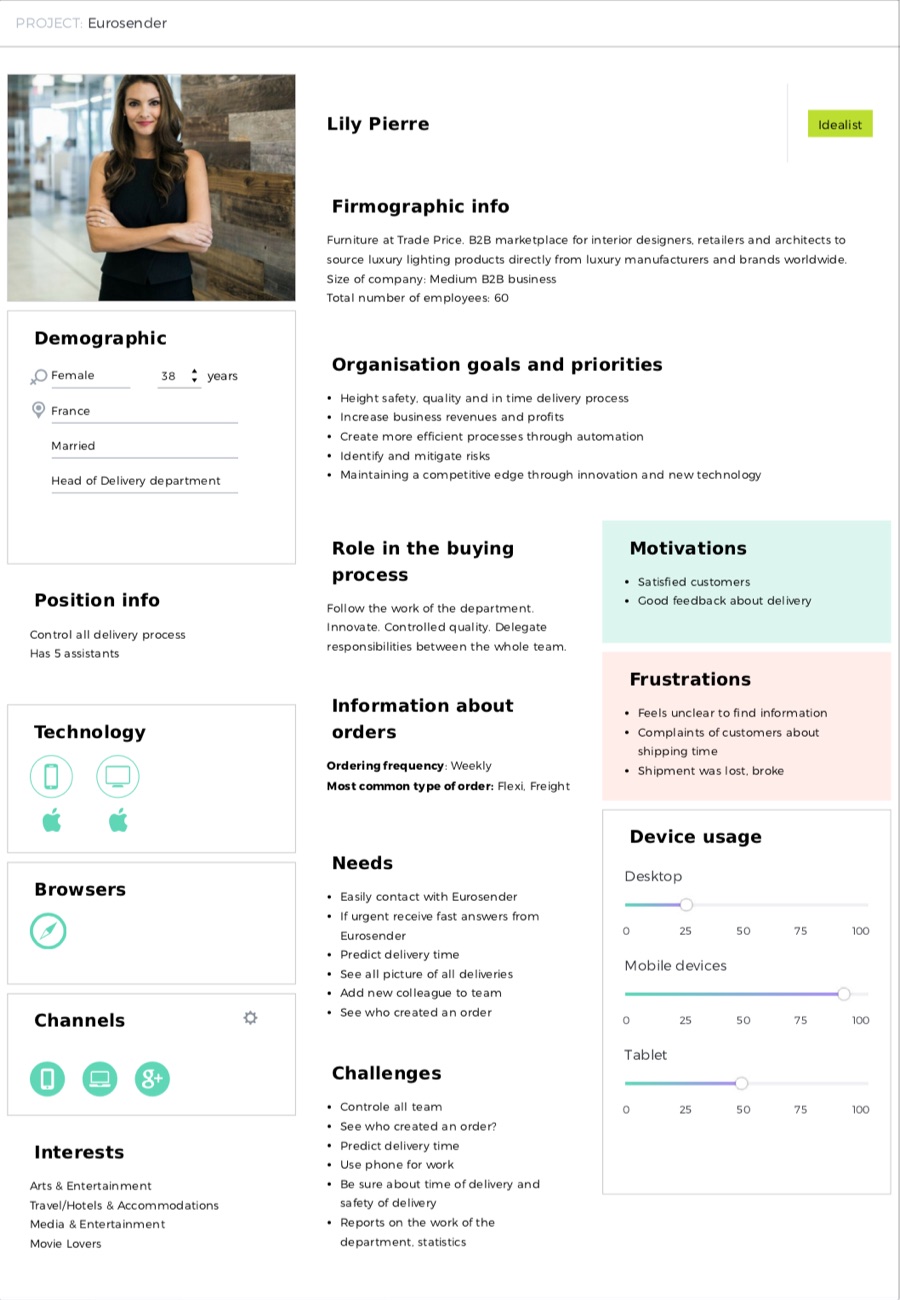
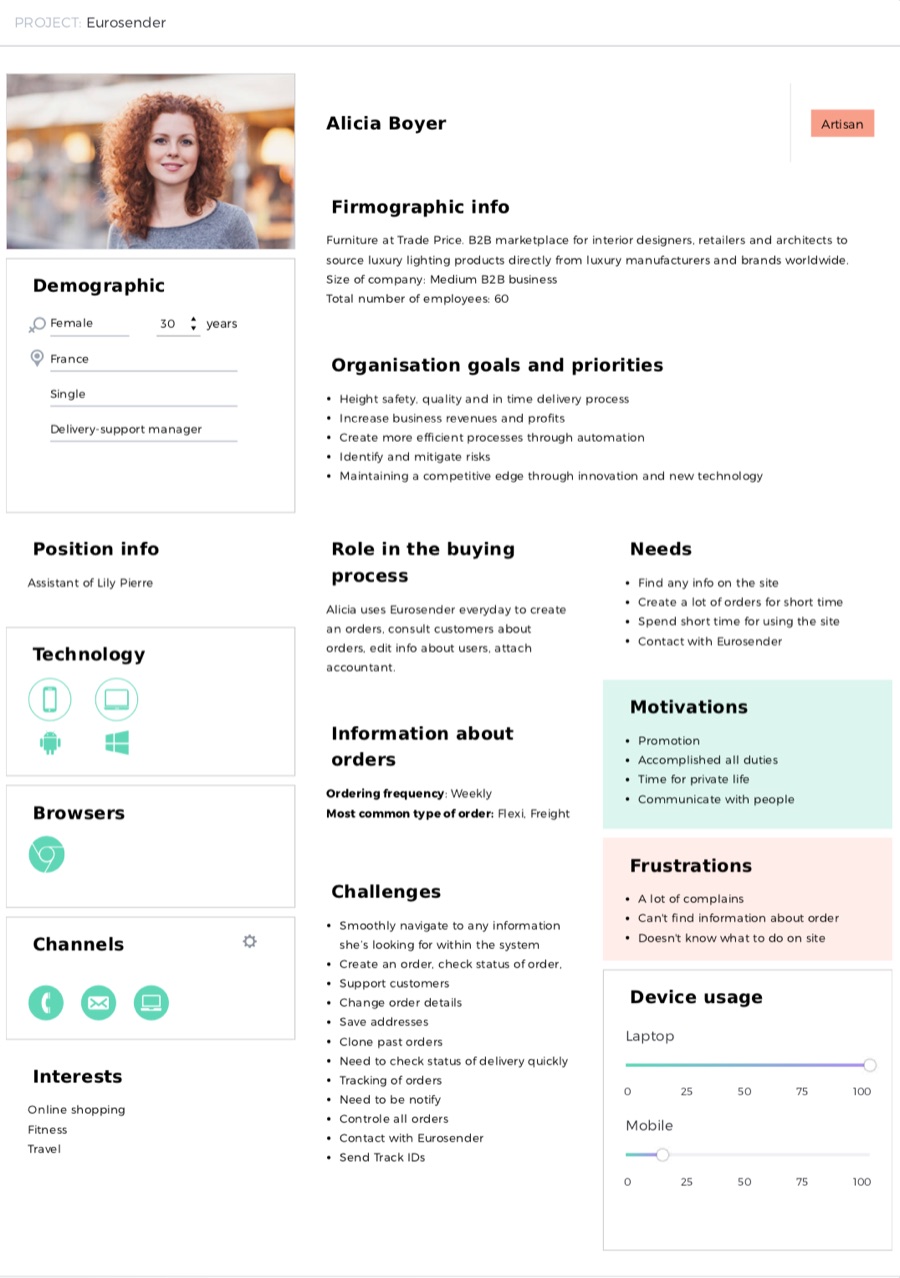
Interviews condensed into three B2B personas covering the whole delivery chain — the manager creating orders daily, the department head who needs oversight, and the assistant handling customers. Their shared frustrations — unclear information, lost shipments, no order visibility — became the platform's to-do list.
Approach
The architecture was rebuilt around a simple test: can the user finish this task without contacting support? Three principles shaped every screen.
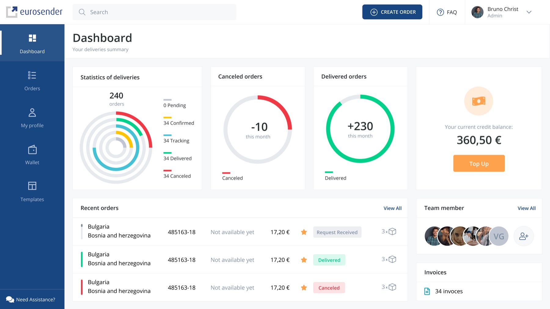
Live tracking on a map, order history with full detail, and a dashboard that shows delivery statistics at a glance — the answers people used to call for.
Credit wallet with top-up, saved payment methods, order templates, duplication, and batch actions turn daily chores into single clicks.
A scalable design system carries the same patterns across web, mobile, and tablet — 300+ adaptive screens that behave predictably everywhere.
Design
Color-coded statuses, filters, favorites, and batch actions — select several orders and pay, star, or download invoices in one move.
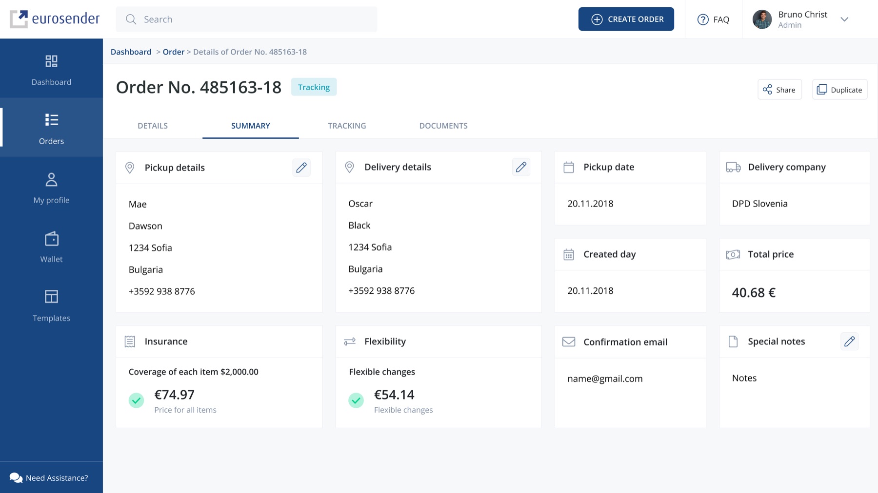
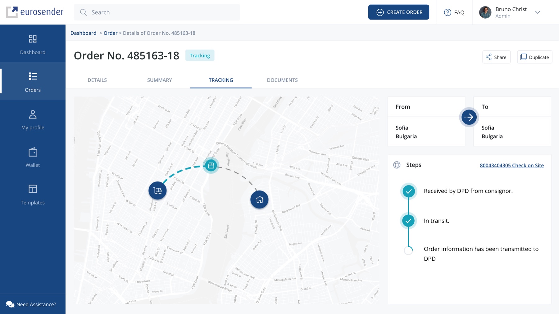
Details, summary, tracking, and documents live in one place — editable in-line, shareable, and duplicable for repeat shipments.
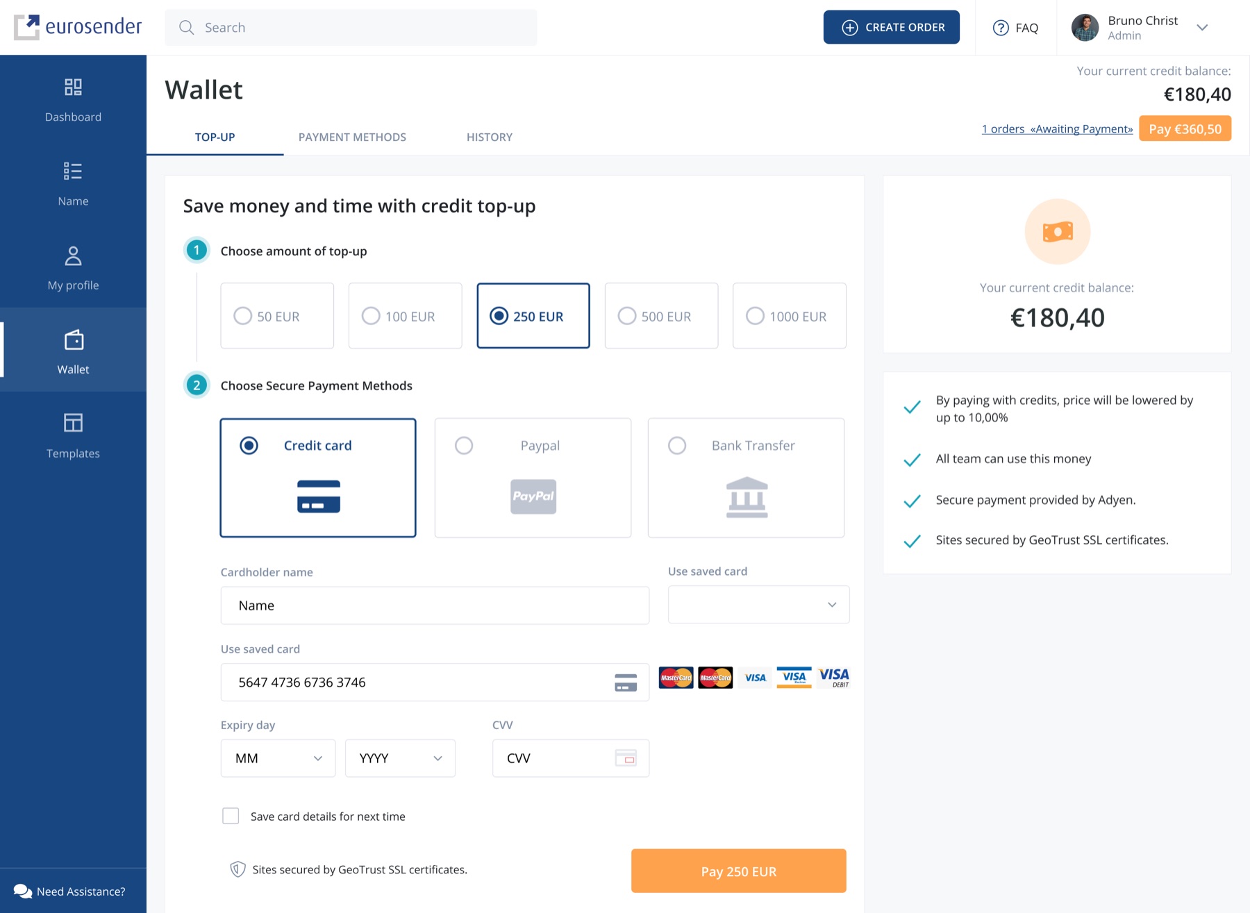
Credit top-up lowers prices up to 10% and lets a whole team spend from one balance — a two-step flow with clearly explained benefits.
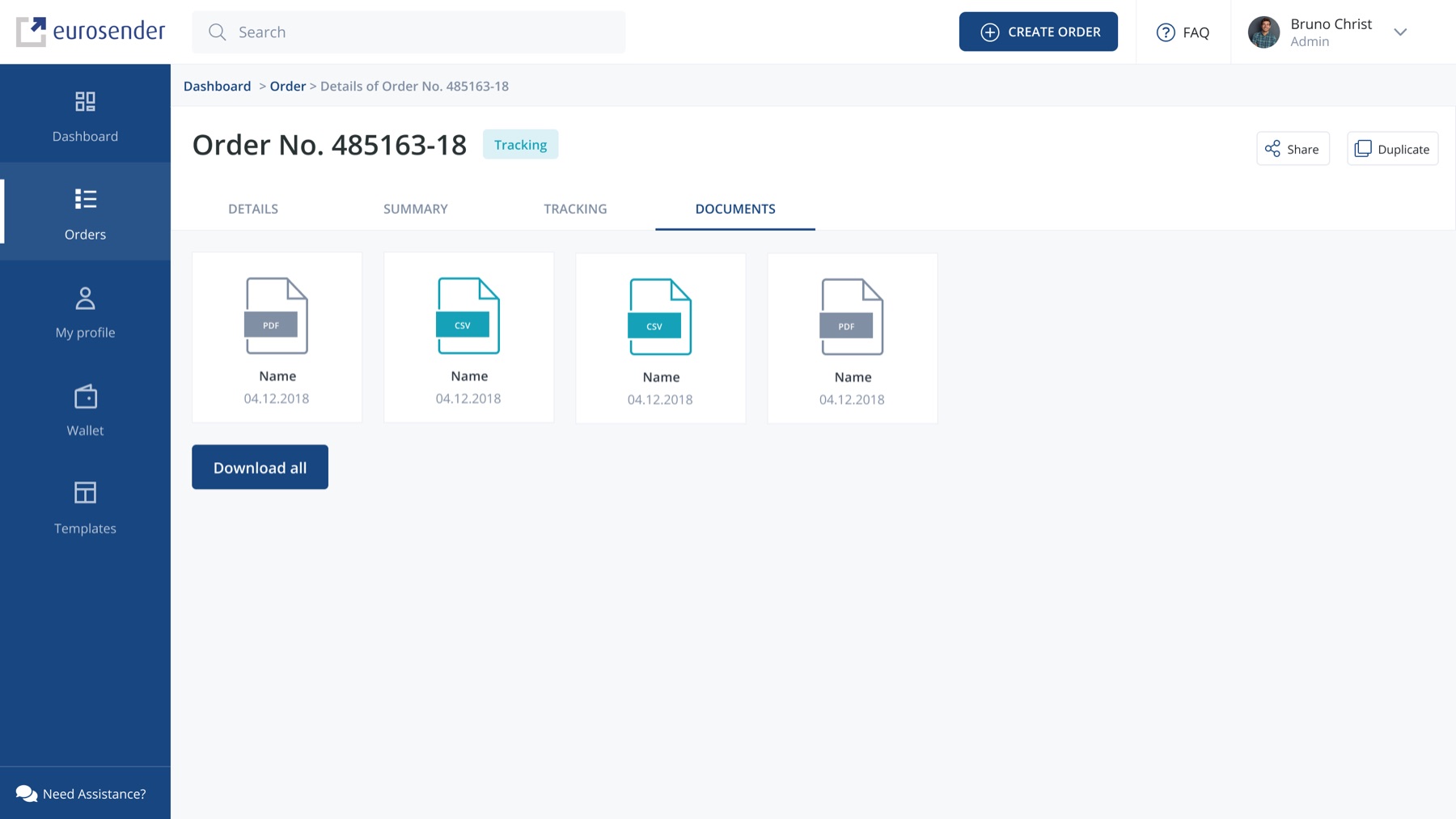
Invoices and shipment documents attached to every order, downloadable individually or all at once — no more emailing support for a PDF.
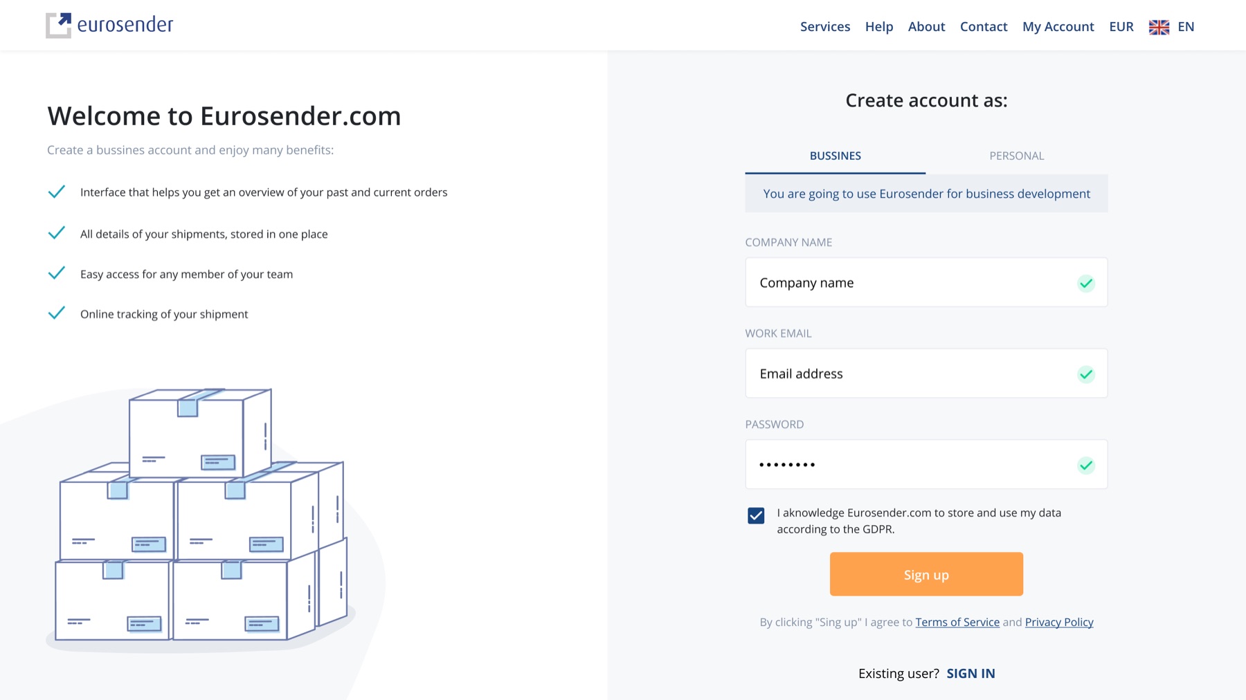
Business and personal paths split at sign-up, so B2B teams and one-time senders each get the onboarding that fits their needs.
Mobile
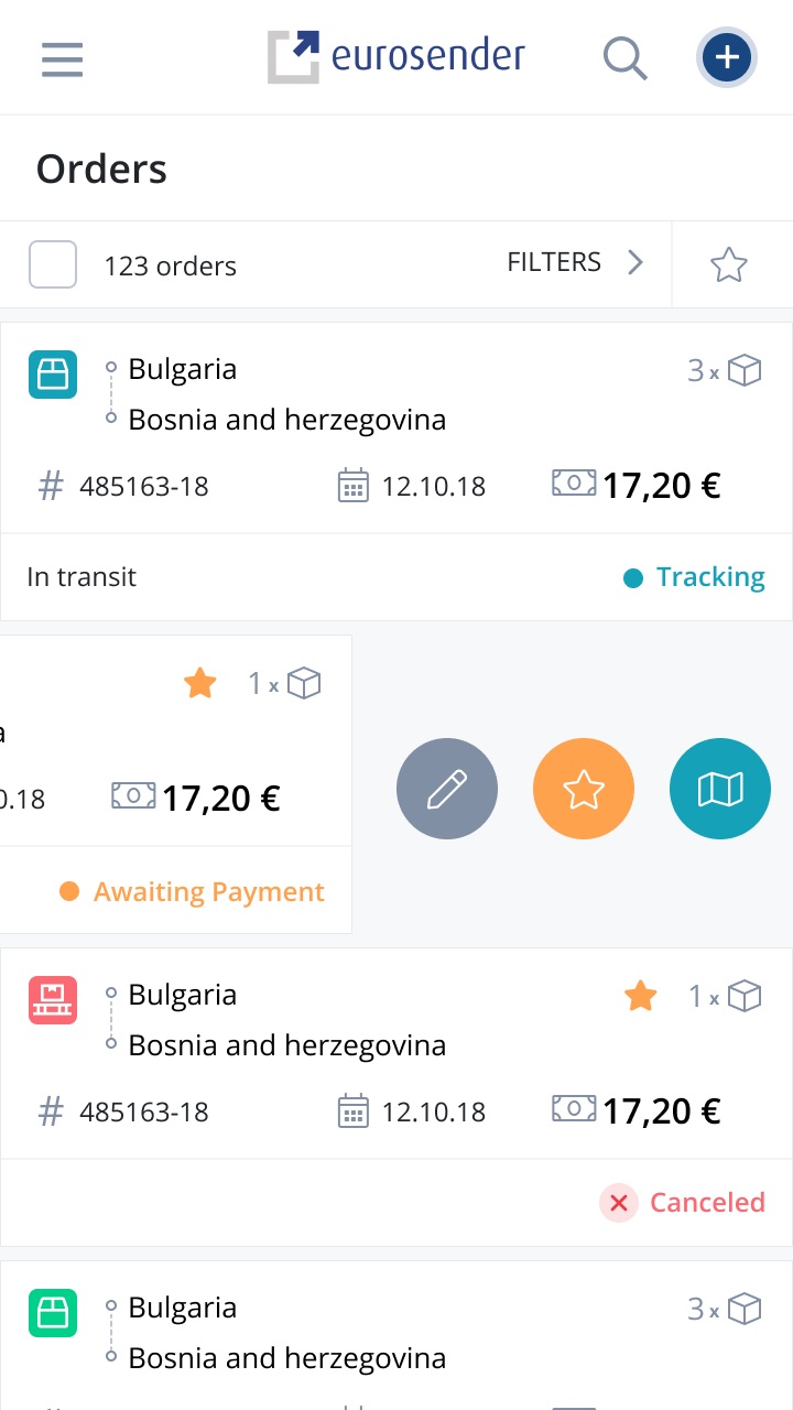
The design system's adaptive components carry the full platform to mobile — swipe actions on orders, batch payment, and status at a glance, without cutting features for smaller screens.
Outcome & impact
Support inquiries dropped 25% as tracking, documents, and payments became self-service.
B2B churn fell 15%, with teams citing new efficiency and transparency in daily operations.
Core tasks completed 30% faster in usability testing with 20 participants — and conversions and retention grew after launch.
NPS improved 30%, and the new design system became the foundation for scalable growth across every device.